Task 1 - Bar chart - model 3 (PRO only)
Write a report for a university lecturer describing the information below.
· You should write at least 150 words.
· You should spend about 20 minutes on this task.
Model answer:
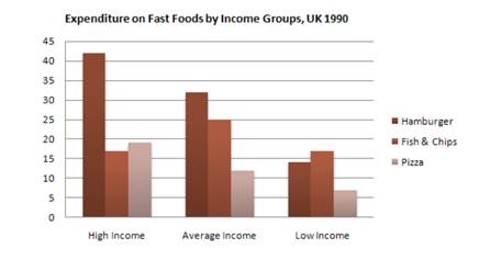
The graph shows weekly expenditure on fast food in Britain by food and income group.
There are two main trends. First, the expenditure is directly related to income. Secondly,
there are differences in the types of fast food eaten by each group.
The amount of money spent on fast food is related to income. People in the high-income
group spent the most - over 85 pence per person per week. People in the low-income group
spent the least - less than half of what the high-income earners spent.
The type of fast food eaten also depends on the group. High-income earners spent 3 times
more on hamburgers than people in the low-income group. Pizza was generally the least
favorite food. Fish and chips was the most popular food with the low-income group but
consumption was fairly similar among all groups.